
Why does styled text show up as empty squares (tofu)?
The same message, sent and received
The two screenshots below show one email styled with ETeext, rich in accented characters. On the phone that sends it, everything looks perfect; on the phone that receives it, the accents break into empty squares.
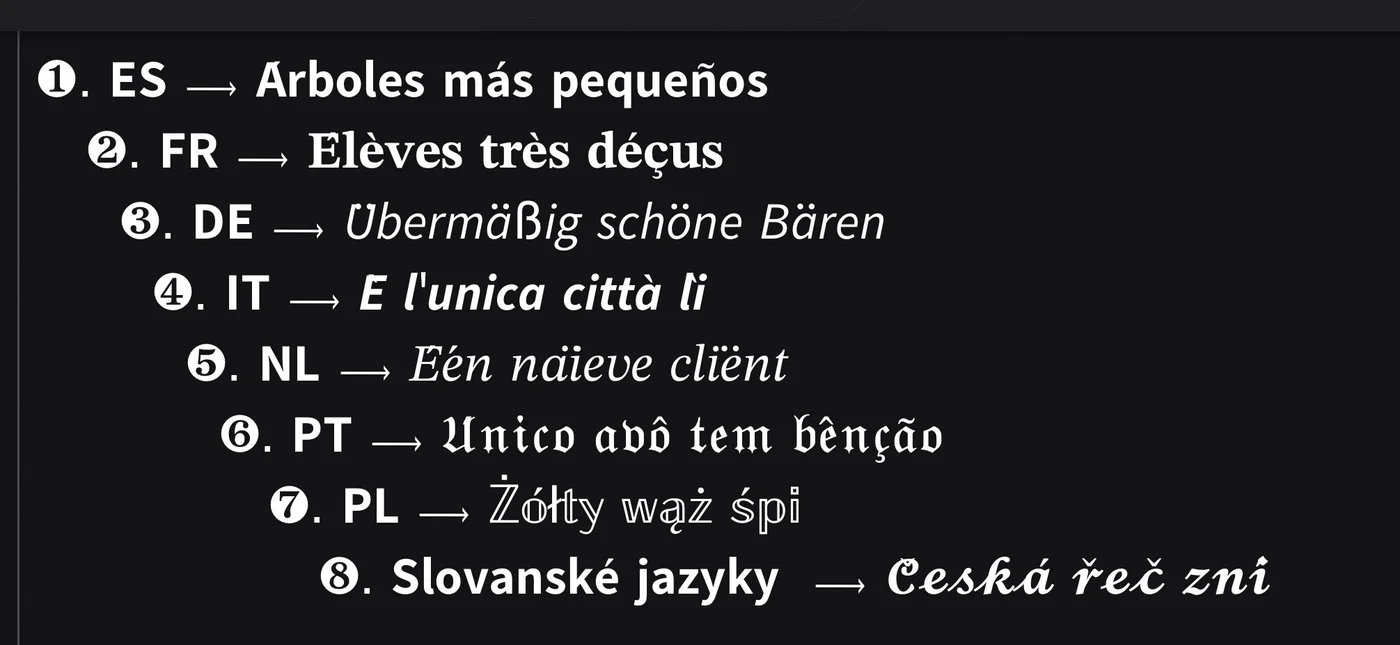
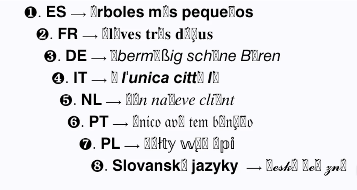
Why do some characters show up as squares?
On some devices, styled characters may appear as small empty squares (or squares with a cross, or a question mark). This phenomenon has a name: it is called "tofu."
The word comes from the resemblance of these little rectangles to a piece of tofu. It is not an ETeext bug, nor an error in your text: it simply means that the device or app displaying the text "on the receiving end" does not have, in its fonts, the drawing of the requested character. Unable to know what to draw, it shows a placeholder rectangle.
This happens more often on certain devices (sometimes "Chinese" ones, or more broadly devices whose system fonts are optimized for other alphabets). Their fonts cover their own writing systems perfectly, but may not include every exotic styled character of the Latin alphabet — hence tofu in place of some effects.
In other words: your text is correct, but the device on the other end cannot fully display it.
Technical section: why tofu appears (and how Safe Mode avoids it)
For the curious, here is what happens "under the hood."
ETeext's styles do not change the display font (which would be a matter of CSS): they change the characters themselves. A styled bold "a," for example, is not an "a" dressed in formatting — it is a distinct Unicode character, drawn from a special block (the mathematical alphanumeric symbols). This is precisely what lets these styles travel across platforms that do not allow changing the font.
The downside is that, to display these characters, the receiving device must have their drawing (glyph) in its fonts. If the glyph is missing, the device shows the replacement character — the infamous tofu. The more "exotic" (uncommon) a character is, the higher the risk that a font does not cover it — and some device ecosystems, optimized for other writing systems, cover fewer of them.
Some effects also stack combining marks: accents or marks layered onto a letter. Here again, their rendering depends on the device's ability to position them correctly; in poorly equipped environments, the result may be imperfect.
The fix: Safe Mode
ETeext includes a Safe Mode. Turn it on before styling, and rather than producing the risky characters, ETeext falls back to standard letters — present in absolutely every font. Your text stays readable on the recipient's device, at the cost of some visual effect.
It's a simple switch you can toggle at any time, depending on the context.